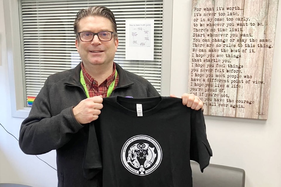
A pair of salmon are front and centre in a new logo design for SD42’s Alternative Secondary School.
The logo, created by a current and former student of the program, was unveiled at the last school board meeting, although it has already replaced the old logo since June of 2023.
Student S. Quiceno, who prefers only their initial be used in their first name, came up with the new design for the logo, which replaced a phoenix logo that was around for about seven years – a design, administrators at the school felt was out of touch with the student population.
The new logo features a male salmon on the left and a female salmon on the right facing downwards in a circle. They are drawn in the Coast Salish style. At the top, their tails outline the symbol for the Metis Nation – an infinity symbol that represents the mixing of two cultures, European and First Nations, to create another – and their heads face two feathers. In the middle of the circle they form are seven fish eggs. And if you look closely at the male salmon, he is designed with mountains, a stream, and clouds on his body.
Now 16, Quiceno was first approached in 2022 to come up with a design.
Quiceno attends the Connex program at the alternative school because they previously struggled in the public school system and was subsequently home schooled for a long time.
After advice from a doctor, the artist started drawing at the age of seven, for therapeutic purposes. At school Quiceno has been putting their designs on T-shirts using the school’s silk screening equipment.
This project was different, though.
It was the first time Quiceno had designed a logo or done anything with graphic design. They started drawing drafts of the logo in December 2022, getting advice from their art teacher Scott Schell and an Aboriginal support worker. Quiceno finalized the design in January 2023.
“It was definitely a learning process,” explained Quiceno. “I needed to get all the elements to work well together and make it look just clean. It was a lot to learn.”
Quiceno enjoyed the thumbnail process, which is making all the drafts. They also enjoyed the research element of the project.
READ ALSO: Maple Ridge Public Library motivates kids to embrace math, art, and science
Salmon were chosen as the main symbol because they symbolize perseverance, noted Quiceno. The fish eggs in a circle represent current and former students coming together in unity. The mountains, clouds, and streams on the side of the male salmon also emphasize the perseverance aspect of the logo.
“In the way that you would have to climb a mountain and deal with strong winds and the way streams are tough,” explained Quiceno.
ALSO: Maple Ridge-Pitt Meadows parents can learn about choice school programs
School principal Steve Wiebe said a change in logo was needed because it wasn’t representative of the school. They wanted a theme of diversity – and something inclusive of their entire student population.
2021 Connex grad Nolan Larson worked on the digital process – cleaning up the design.
Quiceno was happy with the way it turned out, and as an aspiring muralist, is happy they can put it in their portfolio.
SD42 Alternative Secondary consists of three unique student-centered programs – Connex, Reconnex, and Connecting.
